Final Article Mockup Content Choices
2-PAGE SPREAD MOCKUP ELABORATION 03/10/2022
For blog #15 I will create and explain my final mockup for my 2-page, in this case, 4-page spread. Here you will find everything from why I chose certain colors, fonts, and images, to how I then went on to put them together into an ultimate design on the editing tool Canva that has helped me throughout this long journey. In the previous blog I went into great depth on many of the areas that I covered here so I will simply be expanding and adding on to the information from blog #14 here. So if you see some similar information you will know why but remember that I will be elaborating much more here than before and will go more specific instead of more broad. On top of that, if you didn't realize I decided to follow some of the tips that I mentioned in my conclusion of blog #14 by combining layout #1 and #2 into one due to the sheer amount of content that I need to fit. It is also more conventional in my genre to have spreads longer than just 2. Furthermore, I will also be mentioning how my magazine sticks to certain conventions while at the same time intentionally bending other traditions to appear more distinct and add a personal twist on the genre. In the end I will be documenting everything that went into my head during the production and research process of making this 2-page spread.
Desired Outcome:
I, for one, want a 2-page spread that provides the audience with a highly informative and engaging atmosphere while simultaneously remaining simple and clean. Furthermore, I think that the 2-Page Spread needs to actually be a 4-page spread because this allows for such an effect to take place and due to the fact that it is currently becoming more conventional to do so which shows how my magazine is also progressive and modern. This along with the fact that I want my magazine to look sophisticated with a white background and black text makes it appealing to the younger generation that loves sports. In other words, my target audience wants a more comfortable magazine that at the same time can deal with the more serious topics. I also want my article to appear relatable so I utilize pictures of friendship, triumph, and joy at playing the sport, all of which are very satisfying to view as a member of the audience. Therefore, the use of warm colors is quite obvious so that a sense of enjoyment and positivity is reflected onto the viewers from the spread, but not too much to the point where it unfortunately becomes overwhelming and annoying. Another big thing is the fact that to be successful you need to be unique so I need distinct factors that catch the audience's attention, whether that is a special font, an image laid out differently, or even the mere presence of extra pages of the spread. It could also take the form of a table with data.
Editing Tools:
Canva: Before I begin, I want to briefly mention Canva. Canva is a digital design tool that can be used by people worldwide, from students to CEO's, in order to create professional-looking and visually appealing designs. I personally used Canva for my drafts and mockups as seen in blogs #5-6 and I really enjoy implementing its tools into my own designs because they are so simple and it takes a lot less time and effort than it would without it. Canva can be opened on google or can be downloaded in the google store as a chrome extension but when you open it the menu will pop up like this:

Afterwards, you can click on one of the premade templates which was what I did (I chose classroom poster) or you can click on the box in the top right corner that reads create a design and personalize your own design from the very start.

Now, all you have to do is copy and paste your picture into the template and start designing with the wide range of tools provided by Canva. Google Image Editor is very easy to use and later on in the blog I will be mentioning how I used it. It basically functions in the same way that your phone's photo editor works as in reality it is an add-on to the photo app itself.
Selected Original Images: I picked 3 main photos as possible candidates for my 2-page spread's images. Each has a number of reasons why I picked them and I will now elaborate on my choices in this section. To be more specific I chose 2 of my drafts during blog #14 into one final mockup and I will apply all 3 of my edited images to the mockup in order to see how they look with the article as a whole.
Original Image #1:

Firstly, I chose this image because it obviously relates to the life story of the soccer player as it depicts him as a young child which is a key part of the overall plot of this particular article. It also brings the cover into the story as the image is quite similar, more specifically when it comes to color and subject, to the image that was placed on the cover. It is also framed in a full shot which is a respectful and professional distance from the subject without getting too personal or too distant. The photo overall also has a ton of information with the trophy, the background, and the costume all providing the audience with more context than just the article alone. It is also almost the perfect fit for the entire page which is my plan for this particular image.
Original Image #2:

Original Image #3:

The reasoning behind my selection was quite simple, at least for this image. Here you can see right away that the costumes of the image's subject all match the color scheme which I implemented throughout my spread. Additionally, the photo is shot from the distance (wide shot) and perspective of the fan that is quite relatable and realistic. The image also easily incorporates the beautiful and luscious landscape into the foreground of the image which also includes many smiling and happy faces that as a result will hopefully transfer on to the audience and motivate them to continue their reading. The last thing about this image that I enjoy is how it is interconnected with the article itself due to the fact that it demonstrates many of the concepts mentioned in the article that will precede it.
Rejected Original Images:
I also wanted to mention a couple of photos that I considered for the article but I ultimately decided not to select. The main reason behind their exclusion from the spread is the fact that they weren't that easy to relate to the stories being told.


Editing Process:
Image #1:
For the first image it was a bit too tall to fit correctly on the page and the text did not contrast well with the grass so I decided to cut out all of the grass area underneath the pavement because it also felt out of place with the rest of the building landscape. The image also had logos that were halfway in the image so I simply decided to eliminate them completely on the left side.

Afterwards I decided that I wanted to highlight the red more and make it pop so I increased the saturation and contrast to 15 and 10 respectively while the blur was decreased to -15 so that the quality and detail in the image became more pronounced. Lastly, I also decreased the warmth of the image to -50 to create a more calm and collected tone that symbolizes the rest of the article and counters the effect of the saturation increase. Overall the image was very good already but it just needed that extra layer of life that brings energy to everything around it. Before I forget I wanted to remind you guys that this image was then expanded to fill up the entire page and it fit exactly along the borders just as I had planned.

Image #2:
In this case the image was already formatted into a perfect square, therefore it did not require any further cropping. Instead I focused my efforts on bringing out the positive and joyful side of the image by increasing the saturation, contrast, and warmth up to 25. I then enhanced the image as a whole to appear more life-like by decreasing the blur to -25 and increasing the clarity up to 25. Other than that and making the image quite small so that it fits into the bottom left hand corner, this image looked very good especially when combined with the rest of the text features.

Image #3:
Last but not least this image is the only one of the three that is spaced out across not one but two pages so it is of the utmost importance that I edited it correctly. I first cropped out some unnecessary parts of the images such as some of the trees at the top and some of the grass at the bottom. This is so that it could ultimately fit nicely into the space I marked out for it while not overstepping and making the layout too overly crowded. For your information I also had to do the aforementioned as well as the future edits twice due to the fact that the image stretches over two pages.


Next, I thought about how I could improve this image but in reality I truly believed that it was near perfect except for some minor tweaks here and there like upping the contrast and saturation up to 25 while creating a balance with a -25 for the warmth. This illustrates how sports are essentially about two forces going against each other so the saturation/contrast and the warmth act as those opposing teams. The white shirts also pop against the cooler background in a satisfying way that brings attention towards the athlete and his teammates. I then placed the finished image in between the two pages with 1/5 of it being on the left side due to the presence of another image while the remaining 4/5 of the image can be seen on the right side. And I lined up the size with enough space on the bottom and made sure that the top touches the exact middle of the page.


Final Mockup with Original Content and Edited Images:


Elaboration on Content Choices:
Layout:
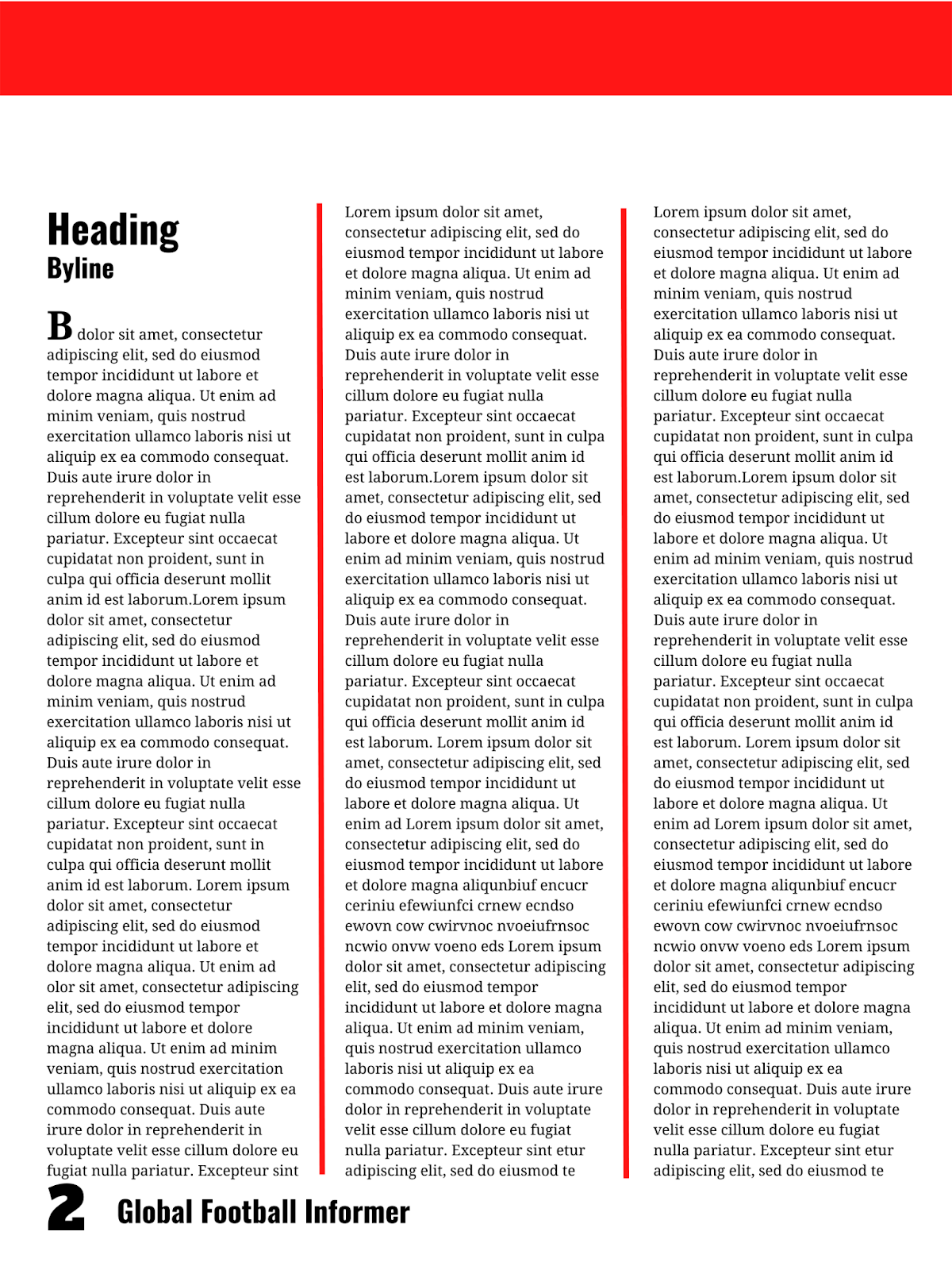
The basic setup for this layout in particular is that I completely separated the information and the image in order for the content to be read more easily and with less breaks. Although at times this is bad because the long text might intimidate the viewer and might seem boring, in this case I wanted to make sure that the viewer did not become distracted due to images popping out everywhere in between the text. The text is very detailed while the caption is more brief and to the point. The image on the second page would also perfectly summarize the first page's details in a manner that also gives the audience somewhat of a break. The image in my final product would obviously be directly related to the information being stated so that the audience receives a visual representation. For instance, if the information was on his early life (which is the case with mine) I would place an image of him with his family or him as a young boy playing the sport. The image's colors would also be similar to the colors on my design. Now to start off the content I wanted to appear more stylized and fancy so I chose to insert a drop cap to catch the viewer's attention and alert them to where the article really starts. To further organize the writing I obviously placed it from top left to bottom right based on what I mentioned in blog #4 about how people read but I also placed dividers between the columns of text to make it easier to read and make the format more spaced out.
Furthermore, I utilize negative space to great effect via my placement of the text slightly lower to allow for there to be more open space to relax the viewer and better guide their attention downwards. I also added a thick bar at the top to convey uniformity between the following pages and take up some of the negative space since before its inclusion the design was feeling a bit too basic for my liking. Next, the title of the article can be found on the top left corner of the paper but slightly more inside so that there is enough space on the borders for easier reading. Right underneath it you can find the byline which paired with the title gives us a bit of context on who wrote it and what it really is about. The same can be said on page 2 for the caption and byline as they are both found in the top left corner, this time slightly higher than the previous page but with the byline underneath the caption. This of course helps connect the text with the image which I learned in blog #4 is influential for the success of the magazine. Lastly, in order to create some kind of flow between the TOC and the 2-page spread I have kept the same exact placement for the page number and the masthead both of which can be found in bottom corners, depending on what side. This also continuously reminds the audience of the specific publication they are reading and maintains a constant theme throughout which I found to be essential for any magazine in my research for blog #4. The actual text was formatted in singular columns with either negative space or actual dividers in between. I decided to break the text up into small paragraphs to keep the audience engaged and make the text appear less intimidating. What's more is that I indented to also prove the level of sophistication that I desire from my magazine in general.
Now for the second set of pages this was their particular layout. First off, the desired outcome of certain aspects like the image and text are exactly the same. However, the image is placed somewhat in the middle of the 2-pages so a good portion of it is on each side. This makes it the center of attention which adds an aesthetic feel to the magazine but it also helps connect the image to the writing through the placement of the writing in a way that it wraps around it and protects/supports it while bringing the 2-pages into one strong article. What's more is that the byline for the photos is placed on the right side of the image, rotated 90 degrees to provide us with more background knowledge while the small caption is placed in between the two images to illustrate their connection chronologically. To organize the writing I obviously placed it from top left to bottom right based on what I mentioned in blog #4 about how people read but I also placed them keeping in mind the fact that I didn't want to overwhelm the audience with a large block of text so I broke it up into columns of text with enough space in between to make it easier to read and make the format more spaced out. The images also play a role in breaking up the text and giving the audience a break from all of the facts and statistics. On top of that, a table was inputted into the spread on the final page to further prove a point in the article itself and fill some of the negative space because without the table, the design would be slightly too open.
Color/Font:
In this case, I used a very simple monochromatic color scheme with only the color red along with a white background and black text. This was done so that the simplicity of the design was more apparent to the audience and so they did not feel overwhelmed in any way. The actual presence of the color red is meant to convey a sense of importance and passion for my magazine according to blog #3 which are the ideal emotions for a 2-page spread to show that the author cares and so should you. Not to mention it contrasts very nicely against the rest of the neutral colors so it is perfect for things like dividers, bars, and numbers/text (data table and pull quote) that are meant to appear amazing or special. Consequently, it assists the reader in guiding their attention to important parts of the design and helps them to better understand what is going on in the design as a whole. Additionally, white gives off a clean and pure vibe that is quite satisfying for the viewer and makes them at ease with the magazine itself so it's perfect for the background and the heartwarming caption above the second page's image. In contrast, the black brings the necessary sophistication and power that is commonly associated with sports magazines and sports in general so the text appears more important and the pull quote more strong than it would have in any other color. Coincidentally, the colors I chose actually mirror the costume of those in the image I chose which brings everything together into one strong, united article.
Now for the font I expanded to 3 as before now I only used 2 in both my cover and TOC. Yet I found that neither font really worked for the actual bulk of the text and during my last blog I discovered that it is conventional to utilize a serif font to convey the overall, especially historical significance of the topics and show how formal and professional we really are as a publication. I also decided to expand because this is the most detailed part of the magazine and I wanted to express to the audience how well thought out the spread was. The font itself is called droid serif so it's quite modern thus communicating to the audience the progressive vibe of the magazine. It is only implemented for the article itself, the drop cap, and its subheadings while the old favorites Alfa Slab One and Oswald make a return for the rest. Oswald can be seen in all of the headings, bylines, captions, and of course in the masthead as that is its typical font. It is even on display for the data table to accentuate the statistical nature of that particular text feature. On the other hand, Alfa Slab One only appears in the page numbers to make them bolder and more impressive/masculine both of which relate to sports, especially men's sports perfectly. Oswald is bolded in everything except the caption and corner headings to show that the information is not only modern and up to date, as I learned in blog #2 is the case with this font, but it also emphasizes it and catches the audience's eye, except for the aforementioned caption and headings which are not as important and instead are more of an added bonus.
Lastly, all of the text is the same size for the article in a super small one that is still easy to read while simultaneously allowing an immense amount of content in. Next, the article/photograph byline, caption, and data table text are all the same size while the main heading, the page number, the masthead, the pull quote and the drop cap all share an equal size to prioritize them even more above the rest of the content. The photograph bylines and subheadings received their very own unique sizes which slightly makes it pop but in reality it is right in the middle of the size scale so that it doesn't draw too much attention to itself due to its lack of importance.
Before I conclude this blog I also wanted to briefly highlight key aspects of my 2-page spread more specifically instead of in broad terms as I did above.
Elements:
Title: Exclusive Interview with GFI Player of the Year: Daniel Rodriguez
The article is all about the life and career of the cover athlete with quotes here and there from an exclusive interview that he did with the publication so the title pretty much sums it up quite nicely. It is placed around the top left corner of the first page but it keeps in mind the spacing above and next to it so that it is not too cramped. It is in the largest font size other than the page number itself and is bolded in an Oswald font. It is lined up with the rest of the article in a symmetrical manner that makes everything feel very organized. It is also in black text with part of it being in the red corner which combined stresses the importance of it and brings out the passion and power of the sport. This exact same title can also be seen on top of the black bar on the outside edges but split up in two with the first part being applied on the left and the second part on the right. This is meant to help the viewer browse through the magazine more easily and quickly.
Bylines/Captions: By GFI Senior Writer: Alfonso Flores/Photograph by Areany Rodriguez
There are two types of bylines that I wanted to mention and those are the article byline that only appears once and the photograph bylines that can be seen 3 times. Although they are all the same size and font (medium sized/Oswald) the photograph bylines are the only ones bolded while the article one isn't. This places a special emphasis on the article byline especially considering the fact that it is only in the layout once. They serve their purpose very well by giving the name of who is responsible for the work being read and observed which helps create a bond between the magazine and its customers. It is also conventional for them to be present which adds to the formal tone that I desire. They are of course next to either a title or an image because they are supposed to expand on the specific feature that they are related to. The same goes for the captions that are the exact same fonts and even colors as the bylines because a lot of the time they go hand in hand. The only difference is that the captions are never bolded to make sure they take a back seat to the real star of the show, the image.
Page Numbers: Global Football Informer #
The main aspect of the page numbers that I found the most useful is how they helped bring not only the TOC together with the spread but also the cover thanks to the corresponding masthead that is placed adjacent to the page number. The page number by itself just wouldn't feel right but the masthead compliments it perfectly and reminds the audience of the publication of the magazine on each and every page. There are two fonts at play here with Alfa Slab One being in the page number while the masthead being in its usual Oswald font and the same size as the article title. On the other hand, the page number is almost double the size and weight to make it easier to read. All of them are placed in the same spot depending obviously on the page which promotes consistency. I also learned in blog #4 that it is important to keep in mind how people read so I placed it at the bottom so that it's not in the way as it's not necessarily vital to the article but it's useful to navigate the magazine as a whole.
Article: An Unexpected Journey/From Zero to Hero/The Boy Who Scored/Gladiator
According to blog #13, the voice of the writing in an article for a sports magazine should find an equilibrium between fun and professional with the writing leaning slightly towards the latter of the two to not only appeal to larger audience but to also appear more credible and trustworthy, both of which are things that a viewer looks for in a publication. Thus. I took that research to heart and decided to implement this voice into my own article. All in all, I was, for the most part at least, able to stay in 3rd person/an objective tone with most of the fun and personal moments coming from the quotes from the interview and the author's response to said quotes. Furthermore, the small but not too small, black droid serif font adds that little bit more of sophistication that my article was lacking and is just really easy to read, especially when paired with the layout of thin columns of text with small paragraphs and indents. It also provided me with the opportunity to place as much detail in the article so that the audience is left satisfied with no doubts. I once again followed blog #4 and warped the text slightly around the image to create a more interactive environment.
Bonus Elements:
Drop Cap/Pull Quote: T/My philosophy is simple: Take the Ball, Pass the Ball, Take the Ball, Pass the Ball.
These two elements were my way of adding some style and grandeur to the magazine to really drive home the fact that this magazine is like no other. Both are in the same exact font, size and weight with the latter of the two being red on a black background to further prioritize it over the rest. It also indicates the love and passion that the quote offers to the reader since the quote itself is very personal. The drop cap is black on white which helps appeal to the older audience that expects a more formal tone. The drop cap is obviously at the very beginning to start the article off with a bang while the pull quote helps to break up the text even more and gives the audience a break while still providing them with more details on the story.
Table:
When I heard in blog #4 that using an infographic will help me communicate information more efficiently, I really tried to find a way to fit one into my spread. Even though this table is not exactly an infographic it still brings that audience's attention to it because it only appears once and it is not commonly found in sports magazines so this perfectly exemplifies how to bend conventions intentionally in order to reach a desired goal. The actual goal is to further cement a point that the author made in the article with a numerical representation. Not to mention that it makes the author seem more intellectual and knowledgeable on the subject. The combination of black and red for this feature helps once again to grab the viewer's attention and show the uniqueness and magnificence of the table and the story that it tells with statistics. The Oswald font also helps illustrate the modernity and perfect nature of the data. It is placed right at the end of the article so that its role is to kind of summarize the article in a simple table which it does to great effect.
Conclusion:
In total, my 4-page spread has a very clean, open, and formal layout that does not sacrifice content for space due to the fact that I decided to use 4 pages instead of just 2. It also aligns with most of the conventions of my genre including a white background, black text, an article title, bylines for both the article and the photos, multiple images with some being placed in between pages while others take up entire pages, warm colors, a serif font, pull quotes, and a drop cap. At the same time it purposefully breaks some traditions like adding a table with season statistics on it and having happier, more energetic pictures when most of the time they are serious or from a live game. The actual article is very detailed and all of the features that I added build on top of the foundation laid out by the text in the first place. On the whole, the 4-page spread has ended up looking very professional while keeping in mind the fun side of things thanks in large part to the hard work that I put in across the past couple blogs in researching and then implementing said research into my own design and original content. All of the well-known brands that I researched in blog #13 had a grand influence on how my mockup finally came out so I am quite grateful for having been able to incorporate the best elements of each into one ultimate version of a 4-page spread.
Tools and Resources Utilized:
- https://www.canva.com/.
- Rodriguez, Daniel. Daniel Rodriguez - AICE Media Studies, Blogger, 27 Jan. 2022, https://danielrodriguez111106.blogspot.com/.
Comments
Post a Comment