2-page Spread Digital Layouts
ARTICLE FORMAT PLANS AND DRAFTS 03/08/2022
For this particular blog post I will be creating 3 distinct layouts for my specific 2-page spread article. Even though they are all quite unique, I still kept in mind the conventions of my genre, therefore there are certain similarities between the designs here and there such as the color scheme and fonts. Moreover I will be providing an extensive and thorough explanation for each and every one of my decisions regarding key aspects of my layout, though no original content will be found as that is part of my next post. Instead this blog will solely focus on the actual design and layout of each special part of my 2-page spread with no concern over original information whatsoever. All in all, I tried to keep everything quite simple and clean to prove the sophistication of my magazine to my intended audience. I will obviously be referring back to my previous blogs in order to better illustrate my reasoning behind certain key choices on the overall layout of my magazine, especially the color theory, font psychology, and magazine tips blogs. Once again I used Canva for my designs and if you need information on how to access its features in order to make your very own designs look back to post #10 for the instructions.
Digital Layout #1:

Layout/Elements:
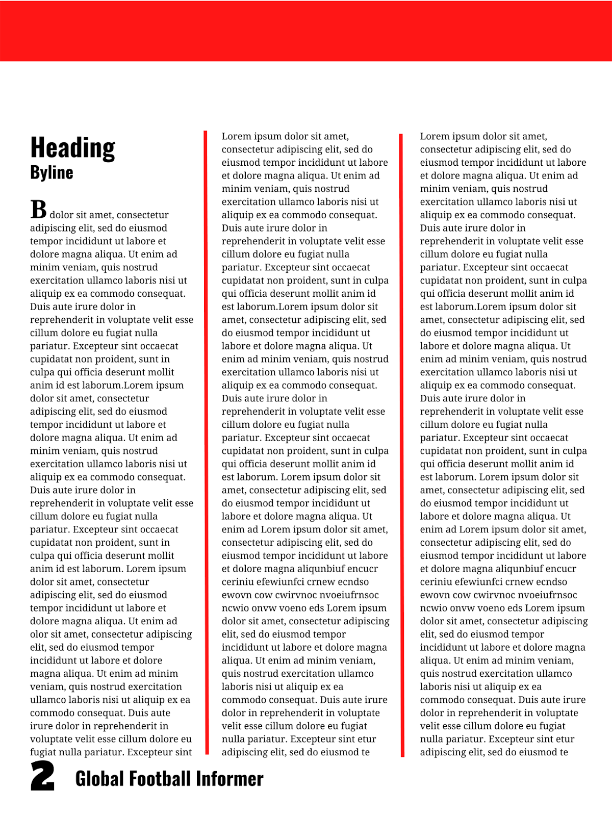
The basic setup for this layout in particular is that I completely separated the information and the image in order for the content to be read more easily and with less breaks. Although at times this is bad because the long text might intimidate the viewer and might seem boring, in this case I wanted to make sure that the viewer did not become distracted due to images popping out everywhere in between the text. The text is very detailed while the caption is more brief and to the point. The image on the second page would also perfectly summarize the first page's details in a manner that also gives the audience somewhat of a break. The image in my final product would obviously be directly related to the information being stated so that the audience receives a visual representation. For instance, if the information was on his early life (which is the case with mine) I would place an image of him with his family or him as a young boy playing the sport. The image's colors would also be similar to the colors on my design. Now to start off the content I wanted to appear more stylized and fancy so I chose to insert a drop cap to catch the viewer's attention and alert them to where the article really starts. To further organize the writing I obviously placed it from top left to bottom right based on what I mentioned in blog #4 about how people read but I also placed dividers between the columns of text to make it easier to read and make the format more spaced out.
Furthermore, I utilize negative space to great effect via my placement of the text slightly lower to allow for there to be more open space to relax the viewer and better guide their attention downwards. I also added a thick bar at the top to convey uniformity between the following pages and take up some of the negative space since before its inclusion the design was feeling a bit too basic for my liking. Next, the title of the article can be found on the top left corner of the paper but slightly more inside so that there is enough space on the borders for easier reading. Right underneath it you can find the byline which paired with the title gives us a bit of context on who wrote it and what it really is about. The same can be said on page 2 for the caption and byline as they are both found in the top left corner, this time slightly higher than the previous page but with the byline underneath the caption. This of course helps connect the text with the image which I learned in blog #4 is influential for the success of the magazine. Lastly, in order to create some kind of flow between the TOC and the 2-page spread I have kept the same exact placement for the page number and the masthead both of which can be found in bottom corners, depending on what side. This also continuously reminds the audience of the specific publication they are reading and maintains a constant theme throughout which I found to be essential for any magazine in my research for blog #4.
Color/Font:
In this case, I used a very simple monochromatic color scheme with only the color red along with a white background and black text. This was done so that the simplicity of the design was more apparent to the audience and so they did not feel overwhelmed in any way. The actual presence of the color red is meant to convey a sense of importance and passion for my magazine according to blog #3 which are the ideal emotions for a 2-page spread to show that the author cares and so should you. Not to mention it contrasts very nicely against the rest of the neutral colors so it is perfect for things like dividers and bars. Consequently, it assists the reader in guiding their attention to important parts of the design and helps them to better understand what is going on in the design as a whole. Additionally, white gives off a clean and pure vibe that is quite satisfying for the viewer and makes them at ease with the magazine itself. In contrast the black brings the necessary sophistication and power that is commonly associated with sports magazines and sports in general. Coincidentally, the colors I chose actually mirror the costume of those in the image I chose which brings everything together into one strong, united article.
Now for the font I expanded to 3 as before now I only used 2 in both my cover and TOC. Yet I found that neither font really worked for the actual bulk of the text and during my last blog I discovered that it is conventional to utilize a serif font to convey the overall, especially historical significance of the topics and show how formal and professional we really are as a publication. I also decided to expand because this is the most detailed part of the magazine and I wanted to express to the audience how well thought out the spread was. The font itself is called droid serif so it's quite modern thus communicating to the audience the progressive vibe of the magazine. It is only implemented for the article itself and the drop cap while the old favorites Alfa Slab One and Oswald make a return. Oswald can be seen in all of the headings, bylines, and of course in the masthead as that is its typical font. It is even on display for the caption. On the other hand, Alfa Slab One only appears in the page numbers to make them bolder and more impressive/masculine both of which relate to sports, especially men's sports perfectly. Oswald is bolded in everything except the caption to show that the information is not only modern and up to date, as I learned in blog #2 is the case with this font, but it also emphasizes it and catches the audience's eye, except for the aforementioned caption which is not as important and instead is more of an added bonus.. Lastly, all of the text is the same size for the article in a super small one that is still easy to read while simultaneously allowing an immense amount of content in. Next, the article byline and caption are both in the same size while the main heading, the page number, the masthead, and the drop cap all share an equal size to prioritize them even more above the rest of the content. The photograph bylines receives its very own unique size which slightly makes it pop but in reality it is right in the middle of the size scale so that it doesn't draw too much attention to itself due to its lack of importance.
Digital Layout #2:


Layout/Elements:
First of all, this layout is clearly very similar to the previous one with a mighty exception being the one and only pull quote. The pull quote serves a wide range of purposes, each more beneficial than the next. I, for one, decided to implement it so that it could first help break up the text, and second it could highlight a special piece of content which I deemed fit enough to deserve such an emphasis. Afterwards, I placed it near the center of its page to add on to its already extreme level of importance. The text is very detailed while the headings and pull quote are more brief and to the point. The image would also perfectly summarize the article's details in a manner that also gives the audience somewhat of a break. The image in my final product would obviously be directly related to the information being stated so that the audience receives a visual representation. For instance, if the information was on his early life (which is the case with mine) I would place an image of him with his family or him as a young boy playing the sport. The image's colors would also be similar to the colors on my design. The image is placed somewhat in the middle of the 2-pages so a good portion of it is on each side. This makes it the center of attention which adds an aesthetic feel to the magazine but it also brings the 2 pages together into one strong article. This of course helps connect the text with the image which I learned in blog #4 is influential for the success of the magazine. What's more is that the byline for the photos is placed on the right side of the image, rotated 90 degrees to provide us with more background knowledge.
To organize the writing I obviously placed it from top left to bottom right based on what I mentioned in blog #4 about how people read but I also placed them keeping in mind the fact that I didn't want to overwhelm the audience with a large block of text so I broke it up into columns of text with enough space in between to make it easier to read and make the format more spaced out. The images also play a role in breaking up the text and giving the audience a break from all of the facts and statistics. Furthermore, I utilize negative space to great effect via my placement of the text slightly inward and away from the borders to allow for there to be more open space to relax the viewer and better guide their attention to the center. I also added a thick bar at the top and right triangles in the top corners to convey uniformity between the following pages and take up some of the negative space since before its inclusion the design was feeling a bit too basic for my liking. Next, the title of the article can be found on the top left corner of the paper but slightly more inside so that there is enough space on the borders for easier reading. Right underneath it you can find the byline which paired with the title gives us a bit of context on who wrote it and what it really is about. The exact same information can be found right on top of the bar so that the audience can more easily navigate the magazine and know exactly what article it is without having to go to the main article title. Lastly, in order to create some kind of flow between the TOC and the 2-page spread I have kept the same exact placement for the page number and the masthead both of which can be found in bottom corners, depending on what side. This also continuously reminds the audience of the specific publication they are reading and maintains a constant theme throughout which I found to be essential for any magazine in my research for blog #4.
Color/Font:
In this case, I used a very simple monochromatic color scheme with only the color red along with a white background and black text. This was done so that the simplicity of the design was more apparent to the audience and so they did not feel overwhelmed in any way. The actual presence of the color red is meant to convey a sense of importance and passion for my magazine according to blog #3 which are the ideal emotions for a 2-page spread to show that the author cares and so should you. Not to mention it contrasts very nicely against the rest of the neutral colors so it is perfect for things like pull quotes and certain kinds of dividers/text features. Consequently, it assists the reader in guiding their attention to important parts of the design and helps them to better understand what is going on in the design as a whole. Additionally, white gives off a clean and pure vibe that is quite satisfying for the viewer and makes them at ease with the magazine itself. In contrast the black brings the necessary sophistication and power that is commonly associated with sports magazines and sports in general. Other than the text and pages numbers black can also be found on the bar that stretches between the two pages further signifying the powerful aura of the magazine. Although black can be found for all of the text, there is one exception to that rule and that is the yellow text in the pull quote. This color is meant to show the positivity of said quote and how it stands out from the rest of the text. Therefore, the color scheme in reality is kind of an analogous one with just a splash of yellow since blog #4 said that using color more sparingly makes its appearance all the more impactful on the audience. Coincidentally, the colors I chose actually mirror the costume of those in the image I chose which brings everything together into one strong, united article.
Now for the font I expanded to 3 as before now I only used 2 in both my cover and TOC. Yet I found that neither font really worked for the actual bulk of the text and during my last blog I discovered that it is conventional to utilize a serif font to convey the overall, especially historical significance of the topics and show how formal and professional we really are as a publication. I also decided to expand because this is the most detailed part of the magazine and I wanted to express to the audience how well thought out the spread was. The font itself is called droid serif so it's quite modern thus communicating to the audience the progressive vibe of the magazine. It is only implemented for the article itself and the pull quote while the old favorites Alfa Slab One and Oswald make a return. Oswald can be seen in all of the headings, bylines, and of course in the masthead as that is its typical font. On the other hand, Alfa Slab One only appears in the page numbers to make them bolder and more impressive/masculine both of which relate to sports, especially men's sports perfectly. Oswald is bolded in everything except for the headings in the top corners to show that the information is not only modern and up to date, as I learned in blog #2 is the case with this font, but it also emphasizes it and catches the audience's eye. Lastly, all of the text is the same size for the article in a super small one that is still easy to read while simultaneously allowing an immense amount of content in. Next, the byline, small headings, and pull quote are all in the same size while the main heading, the page number, and the masthead share an equal size.
Digital Layout #3:


Layout/Elements:
First off, the text is very detailed while the caption is more brief and to the point. The images would also perfectly summarize the article's details in a manner that also gives the audience somewhat of a break. The image in my final product would obviously be directly related to the information being stated so that the audience receives a visual representation. For instance, if the information was on his early life (which is the case with mine) I would place an image of him with his family or him as a young boy playing the sport. The image's colors would also be similar to the colors on my design. The image is placed somewhat in the middle of the 2-pages so a good portion of it is on each side. This makes it the center of attention which adds an aesthetic feel to the magazine but it also helps connect the image to the writing through the placement of the writing in a way that it wraps around it and protects/supports it while bringing the 2-pages into one strong article. What's more is that the byline for the photos is placed on the right side of the image, rotated 90 degrees to provide us with more background knowledge while the small caption is placed beneath the smaller of the two images. To organize the writing I obviously placed it from top left to bottom right based on what I mentioned in blog #4 about how people read but I also placed them keeping in mind the fact that I didn't want to overwhelm the audience with a large block of text so I broke it up into columns of text with enough space in between to make it easier to read and make the format more spaced out. The images also play a role in breaking up the text and giving the audience a break from all of the facts and statistics.
Furthermore, I utilize negative space to great effect via my placement of the text slightly inward and away from the borders to allow for there to be more open space to relax the viewer and better guide their attention to the center. I also added a thin bar around the entire article to convey uniformity between the following pages and take up some of the negative space since before its inclusion the design was feeling a bit too basic for my liking. In addition, it helps the total organization of the design and makes everything feel more perfect or strict. Next, the title of the article can be found on the top left corner of the paper but slightly more inside so that there is enough space on the borders for easier reading. Right underneath it you can find the byline which paired with the title gives us a bit of context on who wrote it and what it really is about. Lastly, in order to create some kind of flow between the TOC and the 2-page spread I have kept the same exact placement for the page number and the masthead both of which can be found in bottom corners, depending on what side. This also continuously reminds the audience of the specific publication they are reading and maintains a constant theme throughout which I found to be essential for any magazine in my research for blog #4.
Color/Font:
This layout is clearly the most simple yet the still the most unconventional, especially when it comes to color. Unlike the prior two layouts and most articles in sports magazines, this layout has a black background and white text. This is mainly due to the fact that it makes my magazine different from others but it also places the power and masculinity of sports over the cleanliness and purity of the magazine itself when it is usually the other way around. For the rest of the spread I used a very simple monochromatic color scheme with only the color red so that the simplicity of the design was more apparent to the audience and so they did not feel overwhelmed in any way. The actual presence of the color red is meant to convey a sense of importance and passion for my magazine according to blog #3 which are the ideal emotions for a 2-page spread to show that the author cares and so should you. Not to mention it contrasts very nicely against the rest of the neutral colors so it is perfect for something like a bar around the text. Consequently, it assists the reader in guiding their attention to important parts of the design and helps them to better understand what is going on in the design as a whole. Although white can be found for all of the text, headings, page numbers, masthead, and bylines there is one exception to that rule and that is the yellow text in the caption. This color is meant to show the positivity of said caption and how it stands out from the rest of the text. Therefore, the color scheme in reality is kind of an analogous one with just a splash of yellow since blog #4 said that using color more sparingly makes its appearance all the more impactful on the audience. Coincidentally, the colors I chose actually mirror the costume of those in the image I chose which brings everything together into one strong, united article.
Now for the font I expanded to 3 as before now I only used 2 in both my cover and TOC. Yet I found that neither font really worked for the actual bulk of the text and during my last blog I discovered that it is conventional to utilize a serif font to convey the overall, especially historical significance of the topics and show how formal and professional we really are as a publication. I also decided to expand because this is the most detailed part of the magazine and I wanted to express to the audience how well thought out the spread was. The font itself is called droid serif so it's quite modern thus communicating to the audience the progressive vibe of the magazine. It is only implemented for the article itself and the pull quote while the old favorites Alfa Slab One and Oswald make a return. Oswald can be seen in the heading, bylines, and of course in the masthead as that is its typical font. It is even on display for the caption. On the other hand, Alfa Slab One only appears in the page numbers to make them bolder and more impressive/masculine both of which relate to sports, especially men's sports perfectly. Oswald is bolded in everything except the caption to show that the information is not only modern and up to date, as I learned in blog #2 is the case with this font, but it also emphasizes it and catches the audience's eye, except for the aforementioned caption which is not as important and instead is more of an added bonus. Lastly, all of the text is the same size for the article in a super small one that is still easy to read while simultaneously allowing an immense amount of content in. Next, the byline, small headings, and pull quote are all in the same size while the main heading, the page number, and the masthead share an equal size.
Conclusion:
In total, all of my designs are pretty simple yet effective in their specific desired outcomes whether that be fun or sophistication or even both which is the truth for me. They have all mimicked some parts of the professional magazines that I studied in the previous blog while still adding my own personal twist on each, the most obvious example being layout #3. As aforementioned this layout is very basic but it stands out simply because I put my own unique interpretation of the conventions of my genre into play here. At the same time however, I believe that the design is too different from the rest of my magazine and does not promote the consistency and shared identity which I am looking for and which most, if not all, sports magazines express. As a result this means that I am leaning more towards the first two options though depending on the size of my article and due to them being very similar I might just combine both into a 4-page spread. I might have to tweak certain features to make them more cohesive but this is actually a pretty good idea since they both follow the conventions of sports magazines very well with the first one even being almost identical to the ESPN magazine that I analyzed in blog #13. They both also have very nice contrasts which makes the article a more enjoyable experience and they both include special aspects like a pull quote and drop cap which will make it more appealing to the audience as it makes it appear more unique compared to the rest. Last but not least, some of the alterations I mentioned before might be about making them seem more uniform by adding the same triangles to layout #1. Yet there are also some alterations that have nothing to do with it and are simply things I noticed after I finished and that I think will improve the magazine as a whole. For example, I think I will try to make the text smaller by breaking it up into smaller little paragraphs that isolate specific ideas and makes reading the article less tedious. Also, depending on the article itself I realized that I might have to add subheadings that separate the article into sections each of which cover a specific part of the overarching story described by the main heading/article.
Motivation:
Look at blog post #13 to see and examine the professional 2-page spreads which acted as my source of inspiration and ideas for parts of my design. Each one played a role in the creation of these drafts and I incorporated many similar aspects of the magazines into mine, especially from World Soccer.
Tools and Resources Utilized:
- https://www.canva.com/.
- Rodriguez, Daniel. Daniel Rodriguez - AICE Media Studies, Blogger, 27 Jan. 2022, https://danielrodriguez111106.blogspot.com/.


Comments
Post a Comment