Conventions of Sports Magazine 2-pg Spreads
WRITTEN ARTICLE RESEARCH AND ANALYSIS 03/02/2022
Welcome to blog #13, the start of the 2-page spread. Here I will basically be researching in depth what really constitutes a 2-page spread. In other words I will be finding out the conventional language, layout, and content of a 2 page spread and how these aspects play a role in deciding what the magazine's target demographic and/or audience is. This post will act as an introduction for the next section of my blog that will be all about the creation of my very own 2-page spread that consists of an article and its corresponding pictures, descriptions, etc. Below you will see that I once again chose the 3 popular sports magazine brands ESPN, Sports Illustrated, and World Soccer to act as my model that I will then analyze and attempt to mirror in my own magazine whether that is through direct implementation of certain aspects or using their design as an inspiration for mine while simultaneously adding my own unique take on the conventions. In the end, I will be breaking down each magazine and then comparing them with one another in a way that highlights the best parts of each design.
ESPN:


Written Content:
Out of all 3 magazine brands, this one seems to be the most informal as it tries to be the most friendly with their audience. In reality, they are basically talking to us as if we were right there and they were telling us about a personal story they experienced a long time ago. In this case, the 1st person POV and heavy use of slang terms might seem appropriate due to the fact that the topic is quite an emotional one since it deals with loss. Consequently, this kind of language, although casual, remains serious, simply because of the topic itself of remembering an all time great athlete. As you will soon notice, these articles are very specific on their content and quotes so they can appear more trustworthy and confident, but when compared to the following examples, this article seems a lot less informative and more conversational. This author really tries to relate the information to more popular topics in other types of media and entertainment not only to broaden the magazine's appeal to those that are not completely into sports, but to also show the relevancy and modernity of the topics being discussed. To sum it all up, the writing is done in a manner that prioritizes speed and happiness with sentences being structured very short with little elaboration. This is mainly due to the fact that a lot of this article consists of quotes from the player, all of which are heartfelt and honest. They are also a little bit less strict on grammar and repetition as a result. In total, this article appears to have a very strong introduction that includes a hook of some kind that is somewhat connected to sports but then they find a way to bridge it over completely to sports. In my case it is also very immersive as the introduction states topics that I know about. In the end the article then concludes with a short, sweet, and to the point paragraph that summarizes the article in a manner that leaves the audience with space to continue the story with their own imagination due to the conversational and, for the most part, casual nature of the article in general.
Layout/Elements:
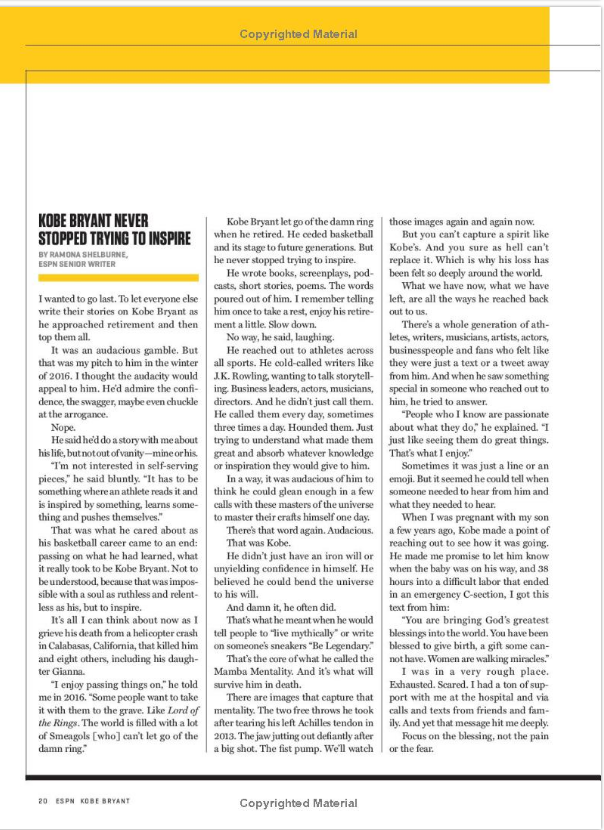
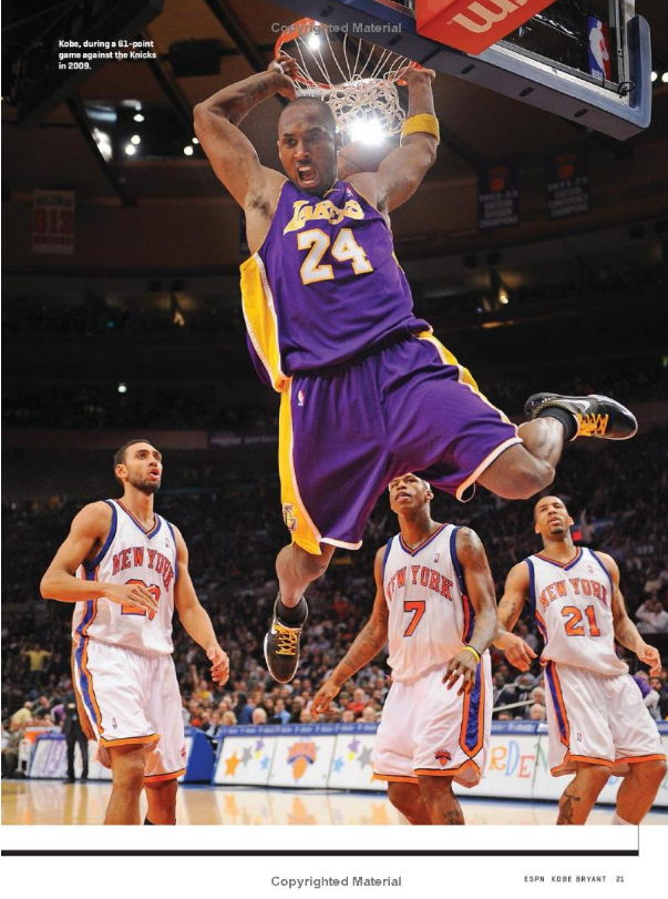
This article includes a wide variety of strong elements that assist the format to make the reading experience as easy as possible. First off, pictures make the article more visually appealing and help the audience relate what they read to real-life images. These images are at times small and fit on one page while others take up the entire page and might even spread to the next in order to better show the connection between the content as a whole. The text is also placed around the text as aforementioned in blog #4 to make the readability easier since the image acts like a divider for the information and also leaves a lot of negative space around the text. As a result, this then ensures that the audience does not feel overwhelmed due to an immense amount of information being crowded in a small space. Additionally, the text is broken up into a large amount of ideas that are in turn split into smaller paragraphs. This is much more satisfying than reading one long, boring paragraph because it keeps the audience awake. The images also include short captions to eliminate any kind of misunderstanding and to make the design even more spaced out. Not to mention that this layout effectively implements the utilization of black, thin dividers to increase the spacing between the text and to promote smaller, more potent blocks of words. On top of that, the dividers appear all over the layout to guide the audience's attention inwards to the more essential details. Lastly, the font and color are really basic with a small, black serif font being used for most of the text on a white background indicating the sophistication and cleanliness of the magazine. Then there are also specific words and phrases that are italicized, bolded, in all caps, yellow, or even in a bigger sans serif text, thus indicating that the information is more important or simply just part of a quote. You may also notice that the color yellow comes up here and there as either an underline for a certain heading or as a bar at the top of the page that develops a sense of uniformity between the pages.
Audience:
The target audience for ESPN is based on a combination of research and my own conclusions. They are mostly men in their late 20's and early 30's who enjoy watching, following, attending, and playing sports. In other words, men who love anything to do with sports and are willing to read information to increase their knowledge on the world of sports. This can be seen from the fact that this magazine touches a lot on the men's side of the game, and not so much on the women's side. For instance, the magazine talks about sporting events, information regarding sports news, exclusive interviews, and season/game highlights of players/teams, which are exactly what their target audience is typically looking for. Their voice is also perfect with a more laid back and modern tone, very similar to what you should expect from sports commentators. This is effective as the target demographic can now easily relate what they hear to what they read. They also are on the younger side so by making the content as well as the design faster and more future oriented the audience will feel more at home.
Sports Illustrated:


Written Content:
This article in particular is an analysis of a player's career/life as well as their current season. In addition, it kind of acts as an interview with exclusive quotes from the player himself being sprinkled in here and there. All in all, this article is quite formal with an academic tone, complimented by the fact that the author maintains a 3rd person perspective throughout except for one word where he says, "we want to," but other than that the author stays away from the informal and at times untrustworthy and biased 1st person POV. At the same time this article creates a more comfortable mood at times via slang terms like, "hell" and by inserting jokes and/or analogies meant to relax the reader and make the article more engaging as well as enjoyable. It is clear that the author wants to create a balance between the 2 sides so he can appeal to a wider audience and not alienate the young or the old from his content. Another good example of this balance is the implementation of facts and statistics from credible sources to support their claims and prove their superiority over less knowledgeable publications. In contrast they then apply some quotes from the player that makes the magazine more relatable as it humanizes the famous player who is known by most, if not all, of the target audience. Furthermore, to appear more relevant they try to mention recent topics that truly matter such as a review of a recent season of a certain sport, which is the case here. In total, this article appears to have a very strong introduction that includes a hook of some kind that is not exactly connected to sports but then they find a way to bridge it over to sports. In my case it is also very immersive as the introduction states topics that I know about. In the end the article then concludes with a short, sweet, and to the point paragraph that summarizes the article in a manner that leaves the audience with little to no doubts due to the discursive and, for the most part, professional nature of the article in general.
Layout/Elements:
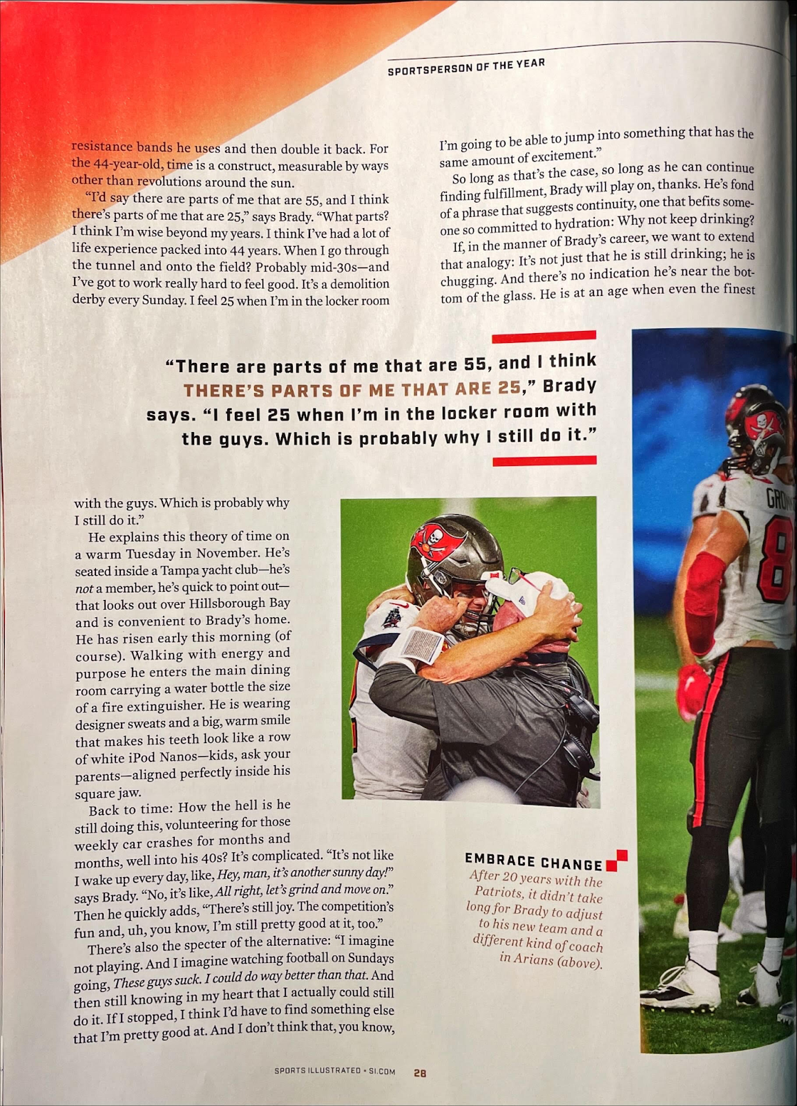
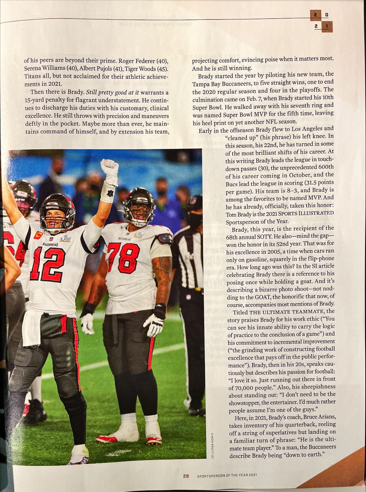
This article includes a wide variety of strong elements that assist the format to make the reading experience as easy as possible. First off, pictures make the article more visually appealing and help the audience relate what they read to real-life images. These images are at times small and fit on one page while others take up the entire page and might even spread to the next in order to better show the connection between the content as a whole. The text is also placed around the text as aforementioned in blog #4 to make the readability easier since the image acts like a divider for the information and also leaves a lot of negative space around the text. As a result, this then ensures that the audience does not feel overwhelmed due to an immense amount of information being crowded in a small space. Additionally, the text is broken up into a large amount of ideas that are in turn split into smaller paragraphs. This is much more satisfying than reading one long, boring paragraph because it keeps the audience awake. The images also include short captions to eliminate any kind of misunderstanding and to make the design even more spaced out. Another noticeable element is the pull quote that helps emphasize a particular piece of content that then not only serves this purpose but also helps break up the text so the audience comprehends what goes with what. Lastly, the font and color are really basic with a small, black serif font being used for most of the text on a white background indicating the sophistication and cleanliness of the magazine. Then there are also specific words and phrases that are italicized, bolded, in all caps, yellow, or even in a bigger sans serif text, thus indicating that the information is more important or simply just part of a quote. Moreover, there are splashes of red and gold at the corners of the pages to add an aesthetically pleasing effect on the design.
Audience:
The target audience for Sports Illustrated is based on a combination of research and my own conclusions. They are mostly men in their late 30's who have an active lifestyle that involves playing sports and following the world of sports. In other words, men who love anything to do with sports and are willing to read information to increase their knowledge on the world of sports. This can be seen from the fact that this magazine touches a lot on the men's side of the game, and not so much on the women's side. For instance, the magazine talks about sporting events, information regarding sports news, exclusive interviews, and season/game highlights of players/teams, which are exactly what their target audience is typically looking for. Their voice is also perfect with an equal mix of maturity and fun being displayed, very similar to what you should expect from sports analysts. This is effective as the target demographic has a wide variety of personalities, some of which require quick and engaging content while others possess the ability to take in the more thought out and detailed information.
World Soccer:


Written Content:
Upon examination, this article is almost a research paper just based on the attention to detail for all of the different statistics, dates, and numerical figures present in the article. The magazine feels very formal with high level vocabulary popping up everywhere along with the immense specificity with which the author conducts himself with. He is not vague and does not leave anything to chance, especially when quoting a person or a publication. The author also does not in any way stray off topic unlike the first article where they tried to cover a wide variety of concepts at the same exact time. This conveys the fact that this particular magazine is professional and intelligent. Additionally, the author speaks in the 3rd person and almost always acts as if they were giving some kind of speech or lecture to students/players as a coach. Before I forget, I also wanted to say how the topic of this article is once again about the life story and career of a particular player, however this time around it does not include any quotes from the player, instead it mentions things that others have said about him. In total, this article appears to have a very strong introduction that includes a hook of some kind that is not exactly connected to sports but then they find a way to bridge it over to sports. In my case it is also very immersive as the introduction states topics that I know about. In the end the article then concludes with a short, sweet, and to the point paragraph that summarizes the article in a manner that leaves the audience with zero questions due to the level of professionalism on display throughout the article itself.
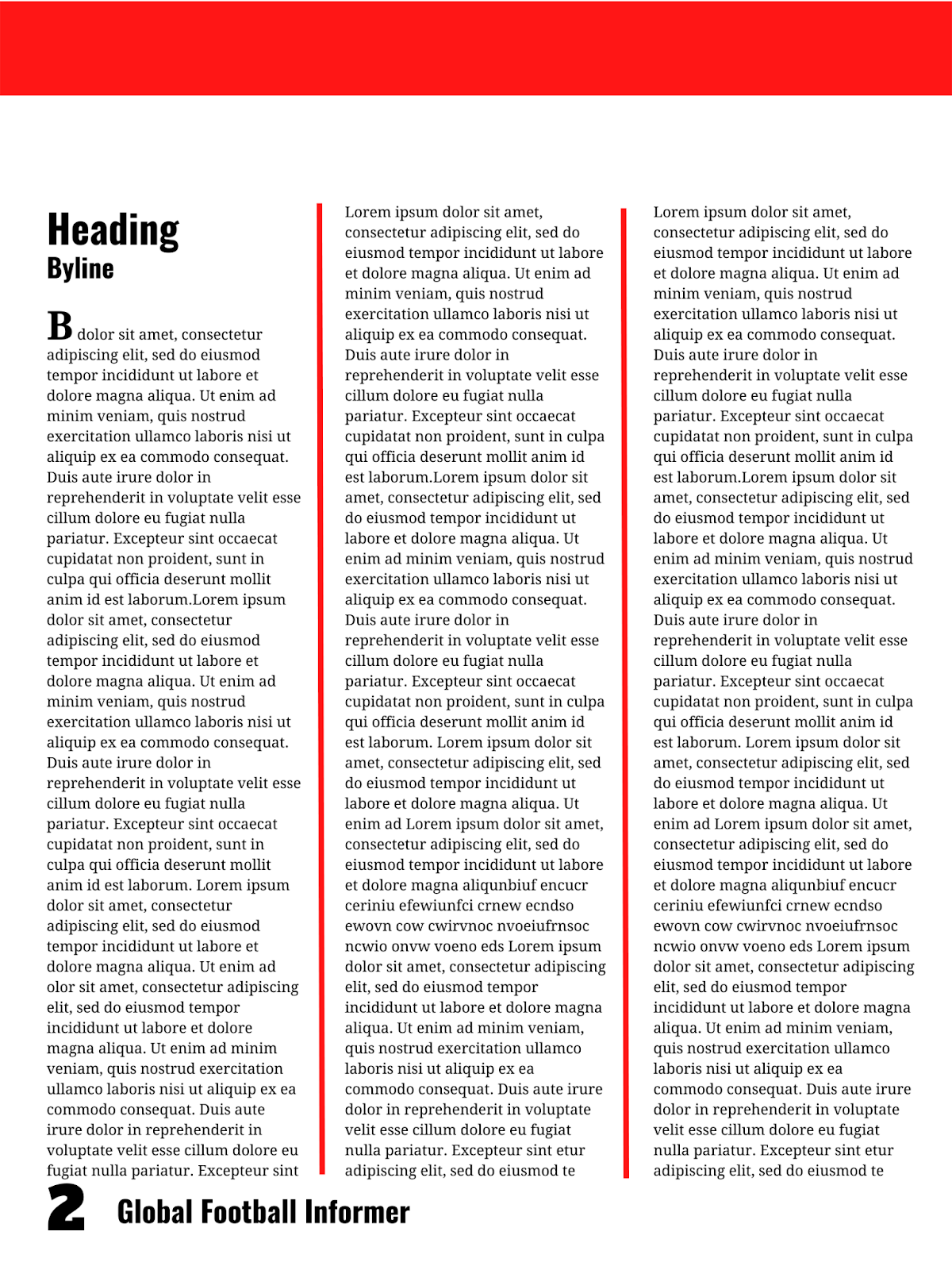
Layout/Elements:
This article includes a wide variety of strong elements that assist the format to make the reading experience as easy as possible. First off, pictures make the article more visually appealing and help the audience relate what they read to real-life images. These images are at times small and fit on one page while others take up the entire page and might even spread to the next in order to better show the connection between the content as a whole. The text is also placed around the text as aforementioned in blog #4 to make the readability easier since the image acts like a divider for the information and also leaves a lot of negative space around the text. As a result, this then ensures that the audience does not feel overwhelmed due to an immense amount of information being crowded in a small space. Additionally, the text is broken up into a large amount of ideas that are in turn split into smaller paragraphs. This is much more satisfying than reading one long, boring paragraph because it keeps the audience awake. The images also include short captions to eliminate any kind of misunderstanding and to make the design even more spaced out. Not to mention that this layout effectively implements the utilization of black, thin dividers to increase the spacing between the text and to promote smaller, more potent blocks of words. On top of that, the dividers appear all over the layout to guide the audience's attention inwards to the more essential details. Next, the font and color are really basic with a small, black sans serif font being used for most of the text and the outline on the sides on a white background indicating the sophistication, cleanliness, and futuristic feeling of the magazine. Another noticeable element is the pull quote that helps emphasize a particular piece of content that then not only serves this purpose but also helps break up the text so the audience comprehends what goes with what. In this case it even appears inside of a text bubble making the magazine more distinct and stylistic. What's more is that they also start the entire article with a serif drop cap that not only stands out because of the size but also since it is in an entirely different font than the rest of the article. You may also notice that the color red comes up here and there as either the background for a certain pull quote or as a bar at the top of the page that develops a sense of uniformity between the pages. It is also the color used for the script font heading at the start to show its importance above everything else on the page. Lastly, a sort of timeline is present at the bottom to further emphasize the detailed nature of this particular article which then stretches out between the pages bringing the article as a whole together into one big story.
Audience:
The target audience for World Soccer is based on a combination of research and my own conclusions. This magazine has a more specific audience, as the name suggests, compared to the other 2 that said sport. They are mostly men in their late 30's and early 40's who are either soccer fans or players, or maybe even both. In other words, men who love anything to do with soccer and are willing to read information to increase their knowledge on the world of soccer so they can then converse with their fellow die-hard fans. This can be seen from the fact that this magazine touches a lot on the men's side of the game, and not so much on the women's side. For instance, the magazine talks about soccer events, information regarding soccer news, exclusive interviews, and season/game highlights of players/teams, which are exactly what their target audience is typically looking for. Their voice is also perfect with an objective point of view which only spits out the truth with little to no opinions. This is effective as the target demographic is searching for the cold, hard facts with an emphasis being placed on statistics of the current season as well as tidbits on the lesser-known, personal lives of players.
Conclusion:
To recapitulate, unlike the other aspects of a magazine, the 2-page spread remains quite similar from publication to publication. Consequently, the target audience is maintained throughout as well with the clear audience being single men in their 30's who love watching, playing, and following sports, more specifically soccer. It is clear to see that these 2 page spreads place an importance on text features such as pull quotes, images, and drop caps in order to keep it lively and engaging which is definitely something I will try to mimic in my own work. I will also attempt to find a balance in my specific language between the professional and statistical side of sports shown by World Soccer and the more open opinionated side of sport shown by ESPN. Therefore, I will actually be following Sports Illustrated very closely as it appears to me that they have actually found this middle ground and it is probably a big reason behind their success. Although I really liked Sports Illustrated's voice I also found certain aspects of the other magazines very interesting as well such as the drop cap, timeline, stylized font heading, and frequent use of dividers to ensure that the information does not become overwhelming. In conclusion, I found a lot of great information here today which I truly believe will come to be quite helpful when I begin the actual production process of my 2-page spread.
Tools and Resources Utilized:
- https://www.canva.com/.
- Rodriguez, Daniel. Daniel Rodriguez - AICE Media Studies, Blogger, 27 Jan. 2022, https://danielrodriguez111106.blogspot.com/.


Comments
Post a Comment