OVERVIEW OF COVER PHOTOS 02/06/2022
This blog acts as a continuation of blog #6 as this blog will go further in depth into the editing of my cover photos that will act as my main image or background. The actual editing will be done through the editing tool Canva which I have utilized before and I will thoroughly explain all of the steps that I took during the editing process. I will be choosing 4 images from my folder to edit and I will think about how they fit into my magazine cover and my magazine genre.
Editing Tools:
Canva: Before I begin, I want to briefly mention Canva. Canva is a digital design tool that can be used by people worldwide, from students to CEO's, in order to create professional-looking and visually appealing designs. I personally used Canva for my drafts and mockups as seen in blogs #5-6 and I really enjoy implementing its tools into my own designs because they are so simple and it takes a lot less time and effort than it would without it. Canva can be opened on google or can be downloaded in the google store as a chrome extension but when you open it the menu will pop up like this:
Afterwards, you can click on one of the premade templates which was what I did (I chose classroom poster) or you can click on the box in the top right corner that reads create a design and personalize your own design from the very start.
Now, all you have to do is copy and paste your picture into the template and start designing with the wide range of tools provided by Canva. I will now explain my desired outcome for my covers before I begin to explain the reasons behind my image selections.Desired Outcome for Cover and Main Image:
I, for one, want my sports magazine cover and main image to combine in a way that is captivating and energetic as well as cool and sophisticated. At the same time, my cover needs to give the readers insight to what will be mentioned inside the magazine itself so that the main image should also have a strong connection to the overall content of the magazine. I also want to have a main image that is conventional and consists of an athlete with either a slightly blurred background or a completely neutral one so that the focus falls almost completely on the subject of the main image itself. Another aspect that I think is very common in sports magazines is the fact that the main image sits slightly on top of the masthead, thus I need an image that would work well when placed over the masthead. Lastly, I want a main image that contains a good amount of color without being too overwhelming so that the color has more meaning and power that can connect to the desired tone. Of course, I would also like to be distinct and unique so I need an image that bends the conventions slightly in an effective manner.
Image Selections: I picked 4 main photos as possible candidates for my cover's main image. Each has a number of reasons why I picked them and I will now elaborate on my choices in this section. To be more specific I chose 2 drafts during blog #5 and I will apply 2 of my edited images to each in order to see how they look with the cover as a whole.
Image #1:
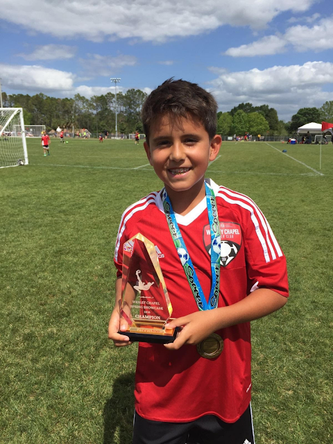
I chose this image because it is framed in a mid shot which is at a respectful and professional distance from the viewer that automatically conveys that tone. The image also has a beautiful landscape that is visually appealing and captivating because it shows how realistic this magazine really is. The image is also related to the content because the star of the main image is one of the main focus points of the magazine and so is the trophy that he is holding since the magazine is a preview for this tournament. The image also perfectly exemplifies all of the key aspects of sports, fun, the outdoors, playing with friends, and of course winning in a very relatable way. Furthermore, there is a lot of negative space which makes the cover look more open and free. What's more, the image has the conventional warm and neutral colors that are commonly found in sports magazines. These colors place an importance on the magazine such as how they symbolize its goodness and power.
Image #2:
The image I chose is one that was taken during an actual match so by showing that the photo was taken live it becomes automatically more interesting. It is also framed in a full shot so that the viewer gets a life-like perspective of the main image and can more easily relate to it. Moreover, by having a shallow focus all of the focus shifts directly to the subject of the main image. The last noticeable thing about the main image is that it is very thin so it should work quite well in a more detailed cover and the subject would fit very nicely on top of the masthead which is another big detail that I want to place an emphasis on. Obviously, this image relates directly to sports since it was taken during an actual match, therefore this image develops a strong connection between the magazine, its viewers, and the sports.
Image #3:
I mainly chose this image because it slightly bent the common conventions of sports magazines. This image does not include an athlete as the subject and instead chooses to focus on the beautiful landscape of a sports complex that is visually appealing while still reminding us of what the magazine is about, sports. The image can also be easily manipulated in a number of ways and cropping it slightly won't hurt it in any way. The text elements would also work very well with the image since I want to use warm colors as my text which will nicely contrast against the cooler colors in the image itself. The last good thing about this image is that it gives off a certain calm and formal feeling that is associated with the beauty of nature in this image and that will combine with the warm colors to convey a sense of power.
Image #4:

This image is very conventional except for the fact that the subject of the image is smiling happily. Typically, these kinds of images have a serious faced subject who at times is not even looking directly at the camera. This time however the image bends conventions while still showing how it fits perfectly into the genre. The image is very up close and personal which creates a trustworthy connection between the magazine and the audience that is very wholesome. I also like this image due to the fact that the neutral background contrasts very well with not only the subject but also with the costume which signifies power and professionalism. Overall it deeply emphasizes the subject in the image so that the audience understands what is the most important part of the image since the subject is right in the center in a close up.
Rejects:
Image #1:
I personally did not like this image because first of all it is too skinny. Then, even if I crop it to be smaller the image itself is not that high quality and the subject would still be too small for it to be emphasized in any way. The background is also not ideal with it not being a neutral background or a natural one so that the background looks slightly crowded and low quality. The image also includes way too many colors for my liking and even though it creates a connection to sports there are a lot of elements to focus on, thus overwhelming and distracting the audience.
Image #2:
Unlike image #4 where the background contrasted nicely with the subject, this image does the opposite and makes the subject blend in with the background. The image is also too bland and simple with nothing that makes it distinct or visually appealing. Additionally, the lighting does not work well with the costume of the subject because as you can see the name on the back of the jersey has a glare that conveys informality and is not good looking at all. Lastly, the image feels a little bit blurry around the edges of the subject which would make it hard for me to replace the background with a new one.
Editing Process:
Image #1:
As you can see, the tint was a bit too warm which caused the image to not look very clear. Also the text was not easy to read when the image was like this, so I decided to change the image slightly via Canvas and their amazing design tools. I first increased the saturation of the image up from 0 to 15 in order to make the image stand out more. Afterwards, I made the image more distinct and detailed by decreasing the blur from 0 to -50. Next, in order to balance the effect of those two adjustments and the original problem with warmth in a satisfying way I decreased the warmth from 0 to -100. Unfortunately, I still had a problem with the readability of the text so I decided to add a blue tint to the image so that the warm colors contrasted more with it so that the words became clearer and to simulate a calm and peaceful feeling for the magazine that also contrasts greatly with the energetic side of the magazine as well. Other than that, everything else stayed the same, including the crop and the rotation. And for the placement I simply used Canvas to help me line it up directly in the center while for the size I increased it evenly until there was just a little bit space left just for the outline.
Here's a picture of the settings that I applied:
It is quite obvious that the picture at first was way too thin and tall to fit correctly on a magazine cover so I cropped the image down until it was basically only the player with a little bit of background on either side. In my eyes the image was very distracting and not very appealing.
I then wanted there to be no background so that all eyes would be on the player. Canva thankfully has a very useful tool called background remover and all I did was click on the image and apply the tool so that the background disappeared.
Afterwards, I needed to add a background that would help contrast with my analogous color scheme of warm colors so I chose an aqua gradient background so that not only would the colors contrast but the main image would too.
Next, I started testing out how this would all look like when text was added and I wanted the main image to be more on the right side so that the text was on the left since that is the conventional setup. So, I simply flipped the image horizontally using Canva and put him on the right side. I also thought that the black would look better on the top so that the TOC would be more visible, thus I flipped the background vertically as well.


Lastly, once I started to add text and I started to adjust the size of the picture, I realized that the image did not stand out as much as I would like it to and that the overall quality was not very detailed so I decided to decrease the blur from 0 to -25 and increase the clarity from 0 to 25. I also thought it would look more stylized if I moved the main image forward so that part of the main image was over the masthead so I used the positioning tool from Canvas to move the image's position forward slightly. The image also now looks a lot more realistic.
I first needed to crop the image in a manner that would allow it to fit properly into the magazine cover so I basically trimmed the side with less of the sunset to the left a little until it fit evenly. I then placed it right in the center and sized it a little smaller in order to leave space for the black outline.
I then decided to make the image look stronger and clearer by increasing the contrast from 0 to 50, the clarity from 0 to 25, and I decreased the blur from 0 to -25. Afterwards, I wanted to stylize it even further by tinting the image green so that it contrasted even better with the text and so that as I found out in blog #3, a calming and prosperous atmosphere would be created. Then, to counter and balance this I put the warmth at 100 instead of 0 so that the sunlight in particular stood out more and a happy as well as an aesthetic feeling was produced.
The first thing I did was crop and center the image on the cover so that it fit perfectly and left no space on the sides or the top. I did so that the image appeared symmetrical and professional. I also wanted the focus to be on the player only so by making him take up almost all of the cover I was able to produce the desired effect.

Now I chose to follow a tip I learned in post #4 about using color sparingly by putting the saturation at -50 and the brightness at -20 so that the colored text would pop more while the main image gave off an old-fashioned vibe that appeals to the elderly. At the same time, the use of blue tint and a young subject produces a modern and serene feel that is very attractive especially for the younger generation. Once again I also wanted to make the image more distinct and detailed so I then increased the contrast as well as the clarity to 25. Then the last thing I did was increase the vignette to 50 so that the background had a slightly darker, more serious tone at the edges that would make the text clearer and I decreased the warmth to -100 so that the magazine felt overall more cooler. In the end I didn't switch the background because I thought that the background already worked really nicely with the subject.
Final Product:
Image #1:
Image #2:
Image #3:
Image #4:
Conclusion:
In total, the editing aspect of magazine covers is essential for the production of a professional-looking, high-quality magazine cover. Here, I tested out many options before selecting my final decision on each image and at times I adapted certain parts of the cover so that it fit better with my image. For instance, in images #2 and #4 you can see how I slightly changed the placement and color of the coverlines so that it looked better in relation to their respective main image. Another good example is in images #1 and #3 where I also moved the coverlines in a way that put them in a more visible place that was easier to read. Overall, I really liked how my covers ended up and how, for the most part, they aligned with my genre. I will now briefly sum up my thoughts on each cover before ending my post with a works cited section.
Image #1:
This was one of the 2 covers that I talked about in my last blog and further explored here. This cover shares its layout with image #3 while still having some differences such as the one mentioned above. This cover aligns with my genre in a number of ways like how it contains an athlete standing in the relative center of the image in a mid shot wearing their jersey. On the other hand, the subject is usually serious and is pictured in a neutral background or in an out of focus one instead of a natural background as used in this particular image. Fortunately, this is a very minor change and makes the magazine more distinct from others in a beneficial manner. The fact that the background is in focus gives the picture a more realistic feel that parallels the feeling you get when playing sports outside with friends. It also does not overwhelm the audience and instead adds to the subject of the main image and makes the cover more visually appealing with a beautiful landscape. The image is also very unique and strong which are two key components of sports and are things that athletes strive to be. All in all, I think this will probably be the one that I will continue working on in post #8 as it seems to be the most sophisticated and simple one of the group. There is also almost nothing that I do not like about this cover, maybe other than how some of my fonts look on top of the main image which I can easily fix.
Image #2:
Just like the previous image, I used this cover as one of my mockups in post #6 and I elaborated more on it in this blog. Clearly, this cover is one of the more detailed and energetic ones out there thanks in large part to the main image. The image was taken live during a match, automatically giving the audience a more engaging experience. It is also very common to find such images in sports magazines as they serve this exact purpose as well as to mimic the feeling of watching or playing sports. The background of the image was blurred so the image was in shallow focus and was framed in a full shot that gave the audience a life-like representation of the athlete. The background was then removed and replaced with a neutral blue gradient background in its place so that all eyes were on the subject. This tactic is typically applied in all sorts of sports magazines which once again follows the conventions of the genre. Surprisingly, the image itself is the most conventional out of the 4 although when paired with the cover it becomes the most unique one out of the bunch. This can be seen from the warm colors of the subject's jersey to the subject's serious face. The only thing that could be said about the image that is not only unconventional but also something that I don't find appealing is that the main image's subject is very small to the point that I had to greatly increase his size so that he became the focus. As a result, I honestly feel that the cover is a little bit crowded compared to the rest.
Image #3:
This image is the first of the 2 new ones that I just introduced this post and is very different from them, especially from the previous image as one of the flaws that I have now realized it possesses is the fact that in my eyes there might be too much negative space, thus the audience does not know where to look. Other than that I thoroughly enjoy this image because it is so beautiful and peaceful while still having that energetic and warm aura around it as well. This image has no subject which is very unconventional but thankfully this does not make the cover lose its focus on sports and instead it helps enhance the feeling by developing a strong connection between sports and nature that is deeply satisfying. As aforementioned, this image has a lot of negative space, most likely due to the fact that it lacks a main image to cover said negative space, yet this keeps the design nice and simple so that the audience does not have a hard time reading and understanding the content on the cover. In the end, if I continue working with this cover I will probably have to add some more coverlines in order to fill up some, but not all, of the negative space.
Image #4:
The last image might be the most unconventional for one obvious reason, it is basically in black and white. If that blue tint was not there, this image would be completely in good old-fashioned black and white but thanks to that tint, the image now holds a combination of old design with modern design so that the magazine would appeal to all generations. Another aspect of the image that challenges conventions is the subject being happy and smiling on the cover which I thought was a nice way of creating a positive and more joyful atmosphere that relates to sports. In addition, by being in more dull colors this allows for the text to pop out more and attract the eyes of customers when shopping. Even though all of the parts mentioned above make the image pretty unconventional, the image also sticks to tradition a lot with an athlete as the subject who is framed in a close up with a neutral background and wearing a jersey. Therefore, the balance between conventional and unconventional was done very well here so that it appears to be progressive and new while still taking into account the old ways and how it has been done in the past. Before I forget, one thing that bothered me a bit was just how the main image might be a little bit too big and overwhelming for the magazine and the text is then stacked on top of it which in some cases is not very good for the magazine's image. Consequently, I might have to trim down the image vertically in order to open up some more negative space which is ironic considering that just in the previous image I had too much negative space.
Tools and Resources Utilized:- https://www.canva.com/.
- Rodriguez, Daniel. Daniel Rodriguez - AICE Media Studies, Blogger, 27 Jan. 2022, https://danielrodriguez111106.blogspot.com/.


Comments
Post a Comment